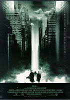
Above are some examples of when warner bros have used intertextuality in their movie posters. the first poster in this post is from the matrix which was released in 1999 and the one next to the inception poster is from the 2008 film the dark night. the matrix poster and the inception poster have a strong resemblence in the way that there is a beam of light in the centre going onto the main characters also it has building either side of the characters which also links with the dark night poster which also has building on each side. The dark night and inception posters have a strong resemlence in that both have a main character in the centre with their back turned away from the camera, also both the main characters are holding something in their hand which is a symbol of the film. My last point on the intertextuality of the posters is that they both have a blue colour to the bacground of the poster.
Thursday, 28 October 2010
Intertextuality within Warner bros
Above are some examples of when warner bros have used intertextuality in their movie posters. the first poster in this post is from the matrix which was released in 1999 and the one next to the inception poster is from the 2008 film the dark night. the matrix poster and the inception poster have a strong resemblence in the way that there is a beam of light in the centre going onto the main characters also it has building either side of the characters which also links with the dark night poster which also has building on each side. The dark night and inception posters have a strong resemlence in that both have a main character in the centre with their back turned away from the camera, also both the main characters are holding something in their hand which is a symbol of the film. My last point on the intertextuality of the posters is that they both have a blue colour to the bacground of the poster.
Analysis of inception marketing campaign
These are some of the inception marketing posters. they all seem to have the same sort of theme with a blue colouring of the background. also all of these posters have got the title of the film 'nception' inbold red writing at the bottom which stands out against the blue colouring of the background. leonardo di caprio is the main character all of the posters this is because he plays the main character in the film. In two of the three posters there are some other charicters who fit in with the mise en scene because they are all wearing smart business style clothes. Also all three are set in stange places with strange layouts to where things are such as buildings in odd places and the one in the middle di caprio is standing in water in the middle of a street which gives an idea that this will not be a straight forward film.
Monday, 4 October 2010
both of these magazine covers have used building as the main themeof the magazine cover. The total film magazine have also used the theme of buildings for the title of the magazine. Both of these magazines have used a large image of leonardo di caprio because he is the main charictor of the film. the pi ture on empire magazine is easier to see di caprio because is is brighter and he seems to have more power. On the total film magazine the picture is darker and he seems to be in some shadows.
Subscribe to:
Posts (Atom)